
This was a 0→1 app design project for Lasso, a home recycling appliance. During the research phase, I collaborated with a team to gather insights, and then, as the sole designer, I led the information architecture, user flows, and visual design.
The project is ongoing as new features are being developed, and I am currently creating the design system to ensure a scalable and cohesive brand experience across both the website and the app.
UX Designer
Sep 2024 - Sep 2025
The Lasso transforms recyclables into pure, manufacturer-ready materials. For this project, the client approached us to design an app for the Lasso.

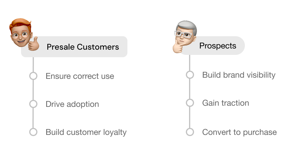
Lasso needs more than a powerful appliance - they need a digital experience that ensures correct use, drives adoption, and builds customer loyalty. Beyond serving existing customers, the company also hoped the app could showcase the Lasso experience more broadly, helping build brand visibility and attract new prospects.
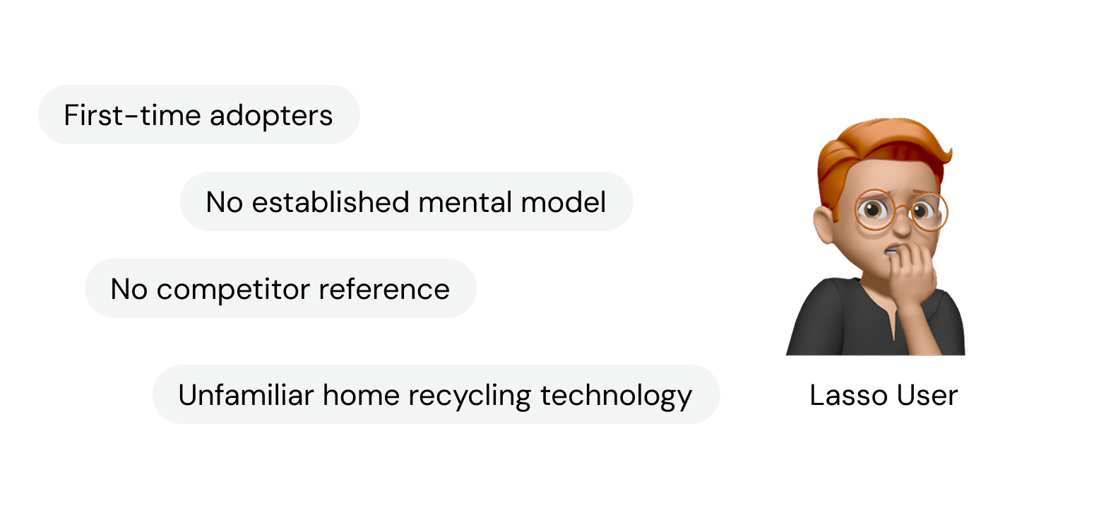
Lasso represents a completely new product category in home recycling technology with no existing market comparisons, meaning all users will be first-time adopters encountering an unfamiliar concept. Without established mental models or competitor references, users face barriers to understanding the product's value and learning proper usage.
To make sure the app complements the Lasso recycling experience, we first needed to figure out what was missing.


I used a top-down and bottom-up strategy to bridge business goals, technical feasibility and user needs.
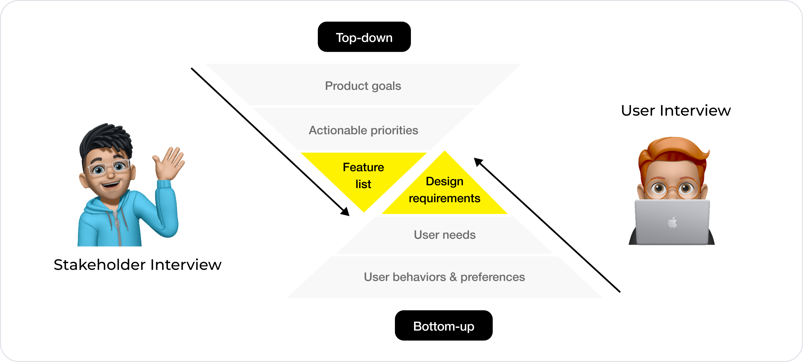
I collaborated with mechanical engineers, software engineers, and the business team to decode what Lasso could actually do—and what it couldn't. These conversations revealed the essential requirements for the app.
All app interactions should align with the machine's physical capabilities and operational workflows
The app should provide continuous monitoring of container status and enable users to schedule collection services
The app should handle error messages, malfunction alerts, maintenance notifications, and customer service escalations
The app must contain engagement features that motivate continued use and build long-term user commitment
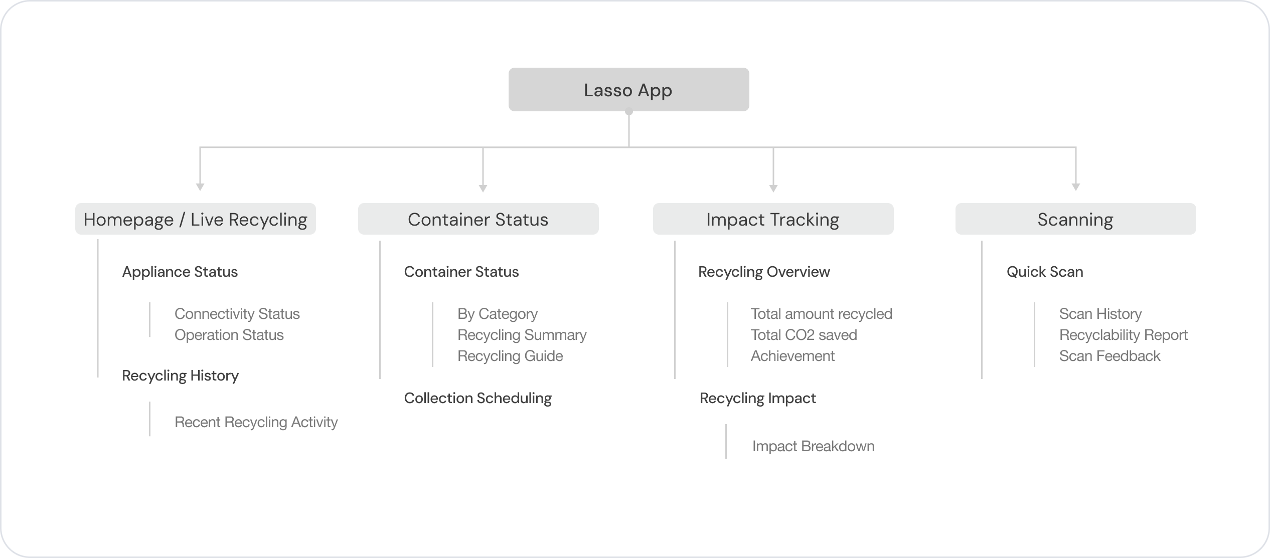
From this, I compiled a baseline feature list that the app had to support.

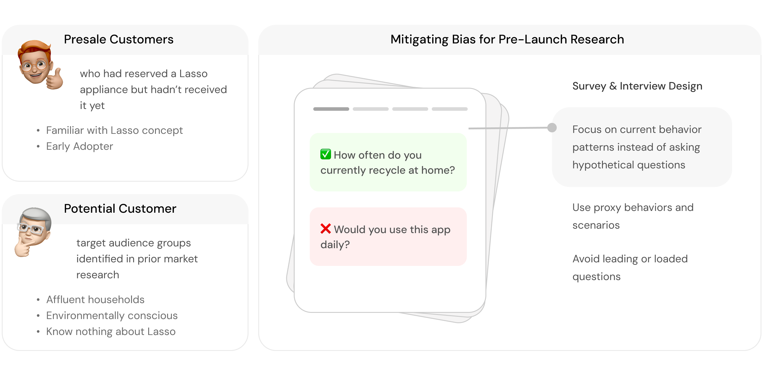
Since the product wasn't on the market yet, I couldn't study active users, so I recruited two proxy groups: presale customers and potential customers. I conducted surveys and interviews with both groups. Because users had no actual experience with the appliance, I carefully designed survey and interview questions to avoid bias.
Through synthesizing findings from surveys and interviews, I developed a set of design requirements.

Users (busy professionals, families with kids, etc) prefer simple flows, minimal steps, and uncluttered navigation.
Users regularly struggle with "Can this be recycled?" decisions. They have basic recycling knowledge but lack specifics.
There’s a mismatch between users' recycling interest and actual knowledge. Users welcome learning more about recycling and the machine.
Users want direct data about their environmental contribution. They prefer clear metrics over gamification.
Since the Lasso is entirely new, first-time users don’t have an existing mental model of what it can do. This meant the homepage needed to do more than simply display information — it had to clearly communicate the appliance’s core functions, support key tasks, and guide users toward the right behaviors.
My initial approach was to regroup the long list of features into themes - What mental model would users naturally bring to this product?

In the first round of usability testing, users found the traditional bottom menu familiar, but struggled to understand the app's main functionalities. Each tab contained too much information without clear actionable cues, making it difficult for users to identify next steps. Task flows were also frequently interrupted when users had to switch between tabs to complete actions.

Users are familiar with the standard bottom menu navigation

Key features are not immediately visible, creating a learning curve for first-time users
Task flow can be interrupted if users have to switch between tabs
Notifications are scattered
I reorganized the hierarchy from being grouped by relevance to being organized around use cases and removed the traditional bottom menu. The upper portion of the page now focuses on machine interactions while the lower portion houses supporting features.
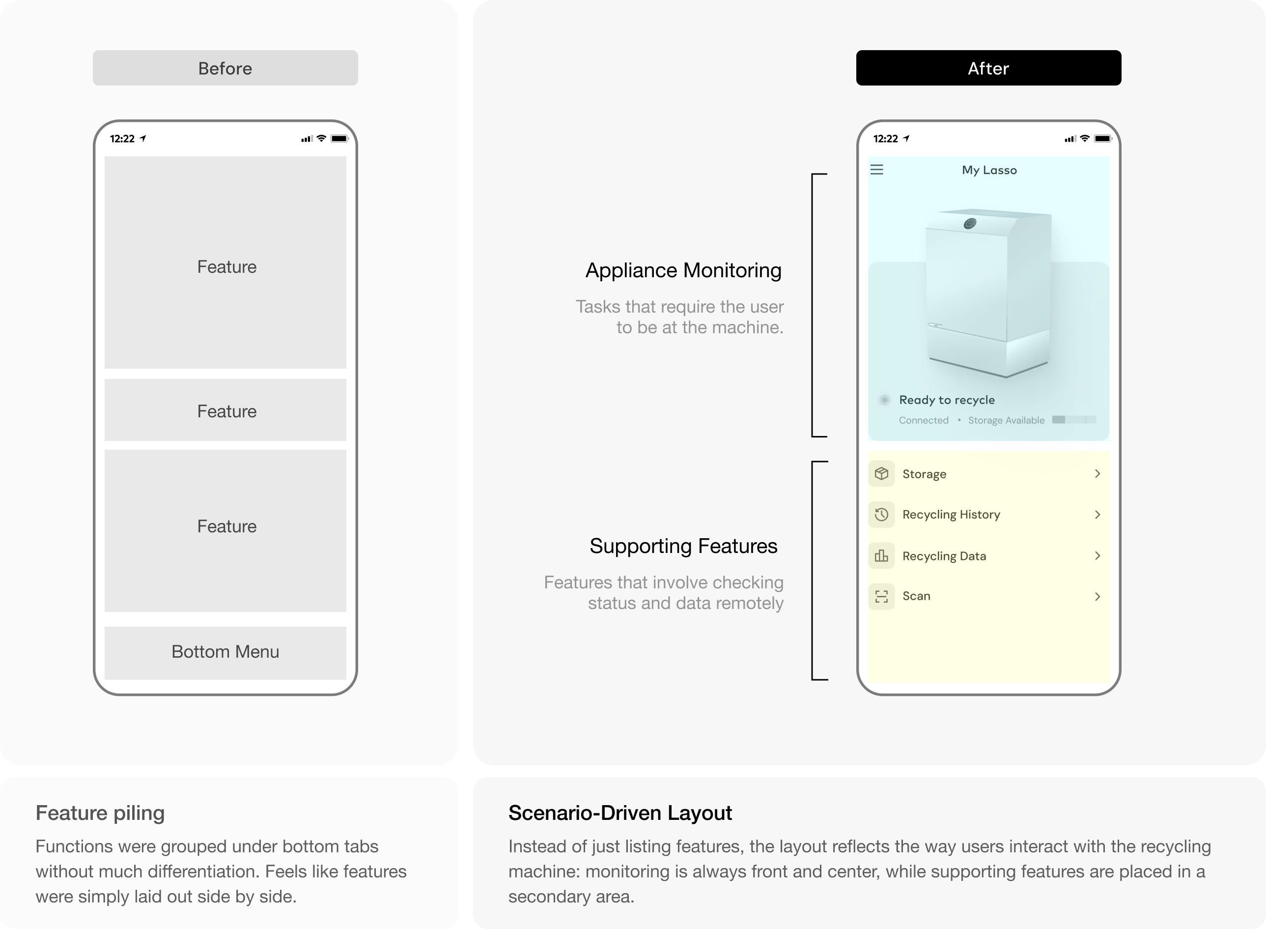
The new layout directs focus to the core flows, and in usability tests, users were less likely to bounce randomly between tabs. The single main control hub feels more appliance-like to most users and eliminates visual clutter. While users reported that it feels less familiar without a bottom menu, the clear visual hierarchy made it easy to identify main tasks.
Users are less familiar with no bottom menu
Potential more navigational layers
Forces focus on the core flow instead of users bouncing between tabs
Feel more appliance-like - one main control hub
Eliminates visual clutter and reduces cognitive load
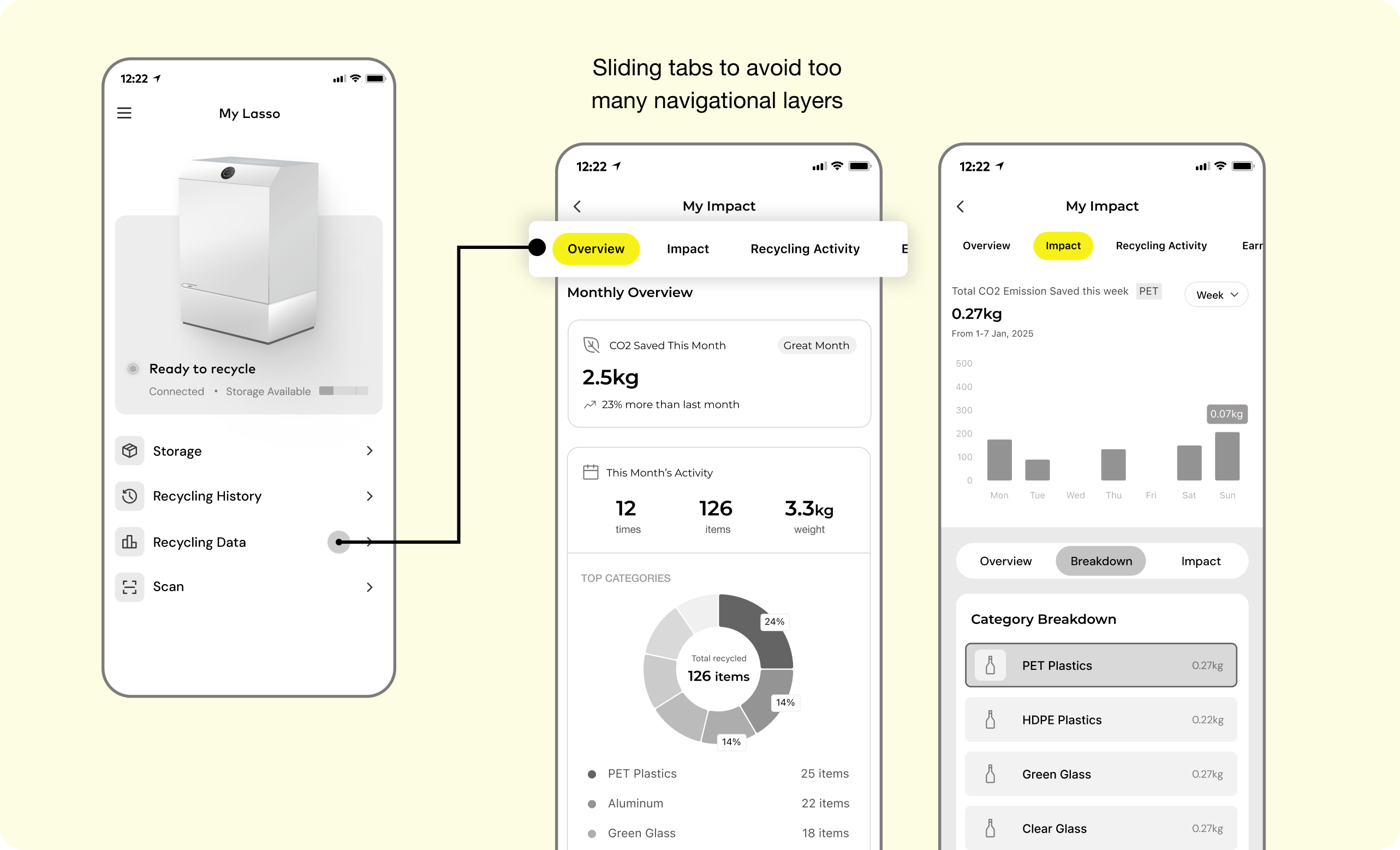
To address the risk of users getting lost in deeper navigational layers and repeatedly hitting the back button, I implemented sliding tabs to organize additional features within the same screen.
Since the Lasso is entirely new, first-time users don’t have an existing mental model of what it can do. This meant the homepage needed to do more than simply display information — it had to clearly communicate the appliance’s core functions, support key tasks, and guide users toward the right behaviors.
I started by mapping the machine flow, documenting every step of how the Lasso works. Next, I identified app touchpoints to determine where the app could provide value - showing item acceptance and rejection reasons, providing instructions for correct use, offering progress tracking, and sending alert notifications.
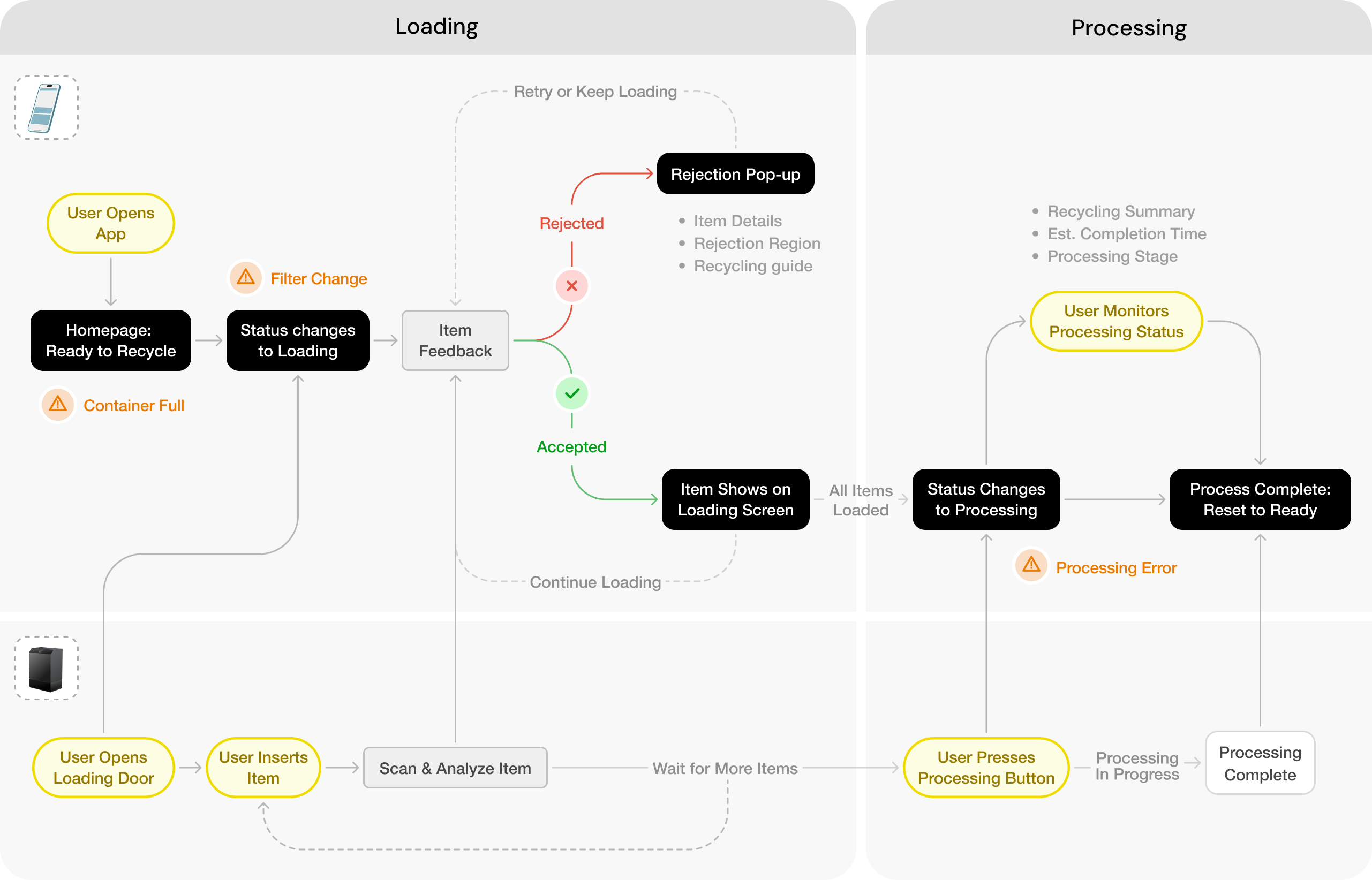
The app flow is seamlessly aligned with the Lasso’s machine flow, with each touchpoint mapped directly to a step in the recycling process.

When users open the loading door, a sliding panel automatically appears showing items, recycling details, and rejection reasons. This creates direct connection between the physical action and digital feedback whild enabling single-handed usage.
The homepage delivers a synchronized experience between the mobile app and recycling appliance. Every physical interaction with the appliance is instantly reflected in the app interface, creating a natural, unified workflow.


Our research indicates that users value clear visibility into their recycling performance as a motivational tool, but prefer not to spend excessive time analyzing data. Here’s how I incorporated simplicity in presenting data.


The scanning feature allows users to check the recyclability and Lasso compatibility of potential purchases. Based on discussions with the engineering team, I have also incorporated a feedback system where users can report misidentified items to help refine the scanning accuracy.

From day one, we brought together our cross-functional team of mechanical engineers, software engineers, and business strategists - and it made all the difference!
The constant communication about user flow feasibility, technical constraints, and potential implementation challenges allowed us to create user experiences that were both innovative and technically executable.
I used to see documentation as the most tedious part of the job. However, throughout this project, I discovered its profound value beyond simply tracking progress.
Thorough documentation not only captured our entire design journey—including key decision points, user research insights, and technical constraints—but also served as a guide when we got lost in the details. Sometimes, stepping back to review documentation can reveal answers and inspire new directions!
