I led the design system foundation and UI modernization as the sole designer on the team. I collaborated directly with the PM to define requirements and user needs, and worked with the development team to ensure feasible implementation. This included establishing the design system architecture, creating component libraries, and driving the modernization strategy across the entire product.
As this is an internal system, the content displayed uses placeholder data for demonstration.
Design an app that drives adoption, maximizes usage, and builds customer loyalty for Lasso's recycling appliance.
Created a user-tested mobile prototype featuring smart control, container status, recyclability scanning, and environmental impact.
Product Designer
Jun 2022 - Sep 2022
AIRSAT delivers complex satellite data services through multiple platforms - each serving different industries with specialized workflows and interfaces. As AIRSAT expands its product suite and custom solutions, the need for consistency, efficiency, and scalability across its digital ecosystem becomes critical.
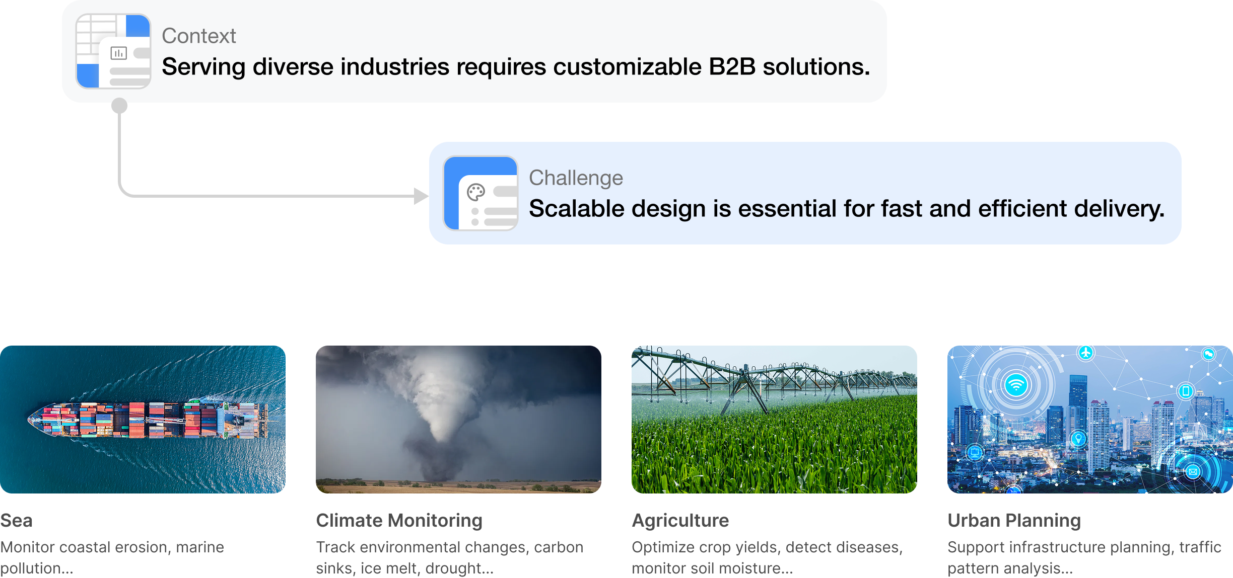
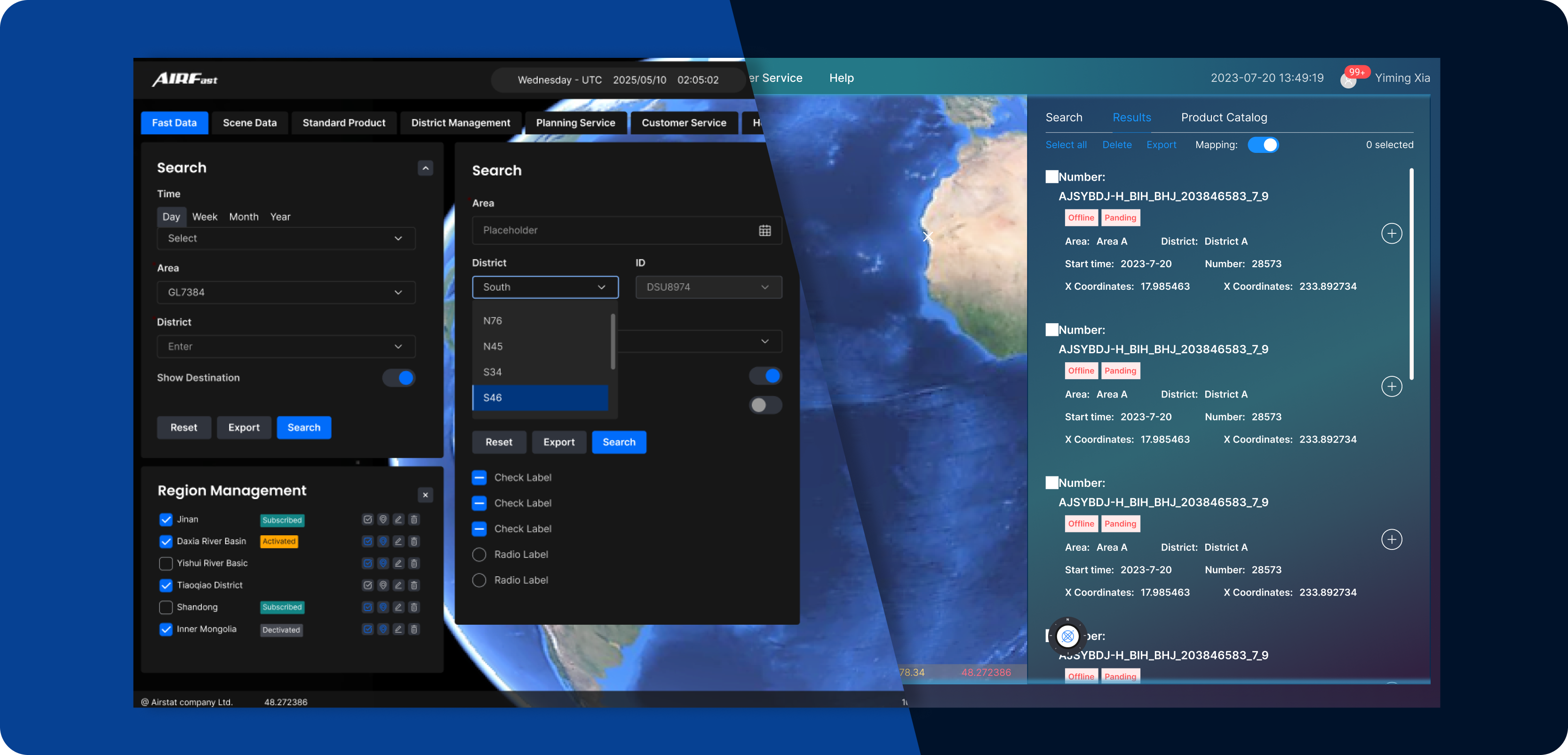
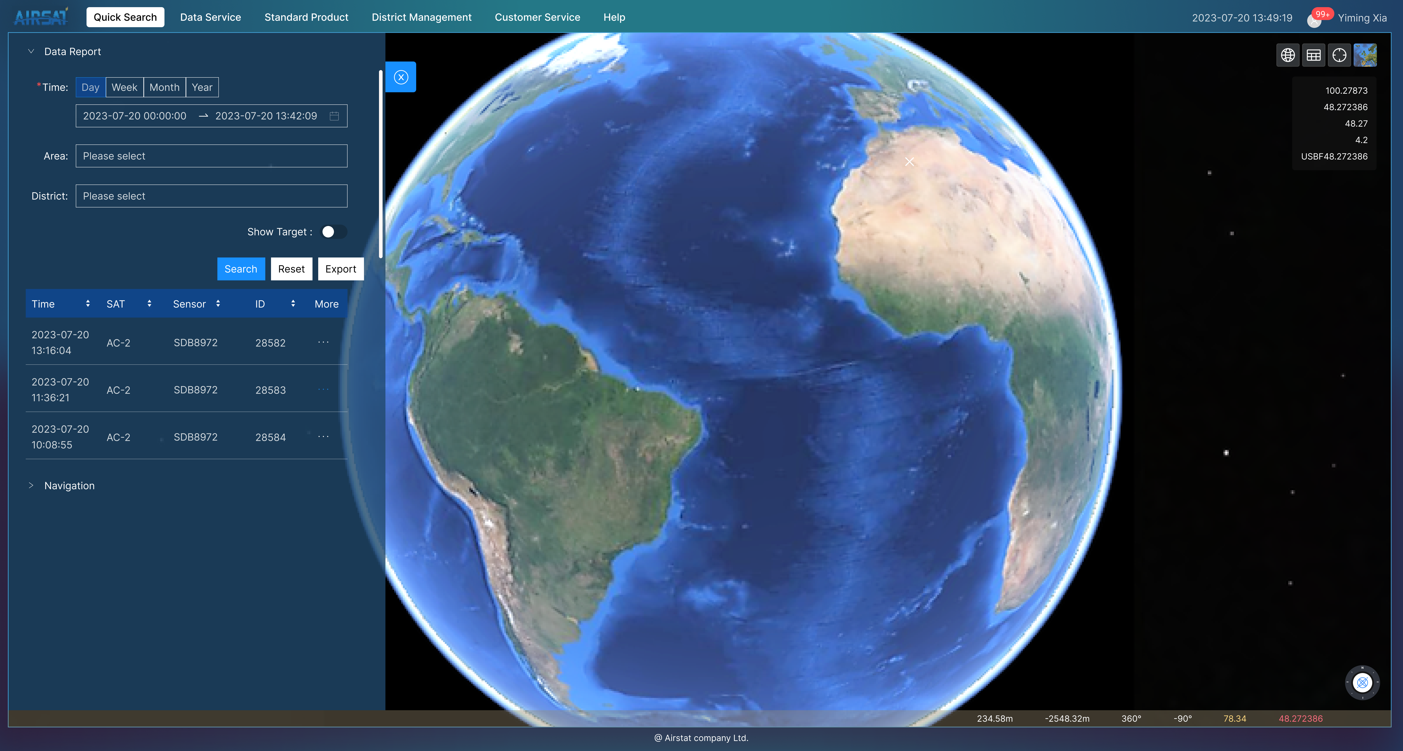
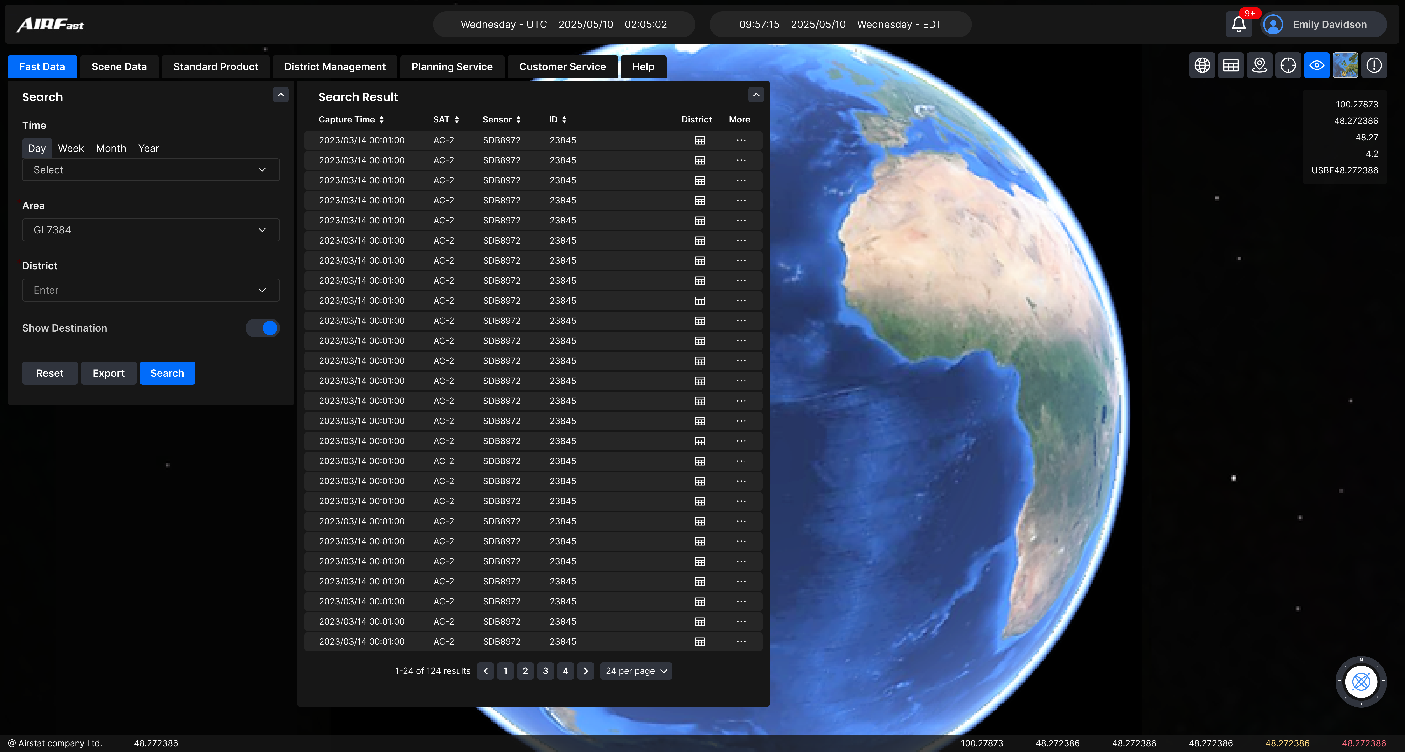
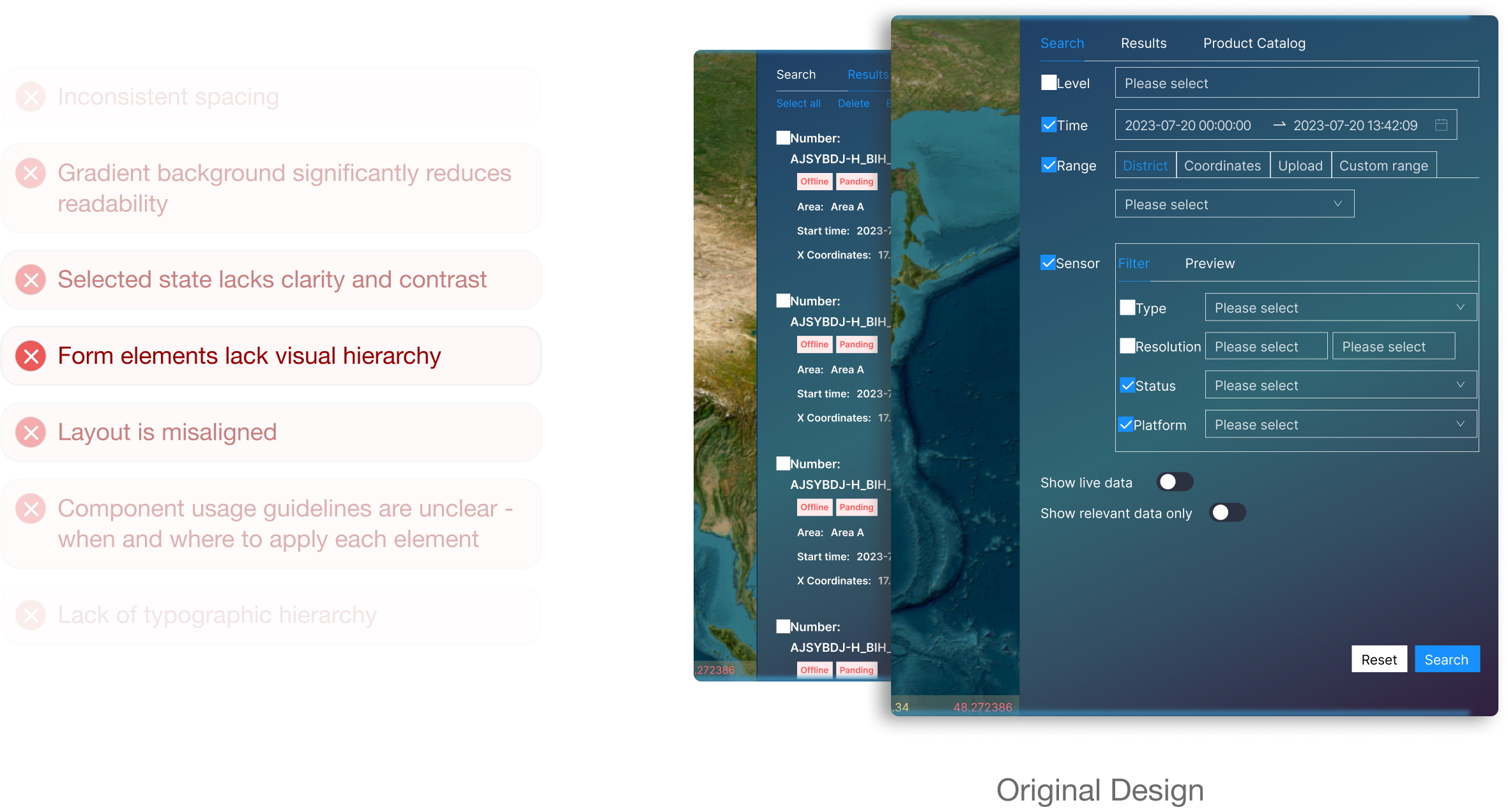
AIRSAT’s platform team frequently receives evolving requests from clients—ranging from urgent bug fixes to the addition of entirely new features like data input forms or custom map layers. These high-paced, client-driven updates demand fast turnaround times across multiple products and platforms. Additionally, the UI has not been updated in years and has deviated from the brand image - It was time for a big makeover.
While existing designs remain functional, many no longer reflect current brand identity. A refreshed system helps meet modern standards and reinforces brand credibility.
With frequent needs for custom solutions, a scalable design system enables faster turnaround times while ensuring better long-term maintainability.
Many usability issues have remained unaddressed for years. A new design system and UI overhaul would enhance readability, refine visual hierarchy, and resolve design inconsistencies.
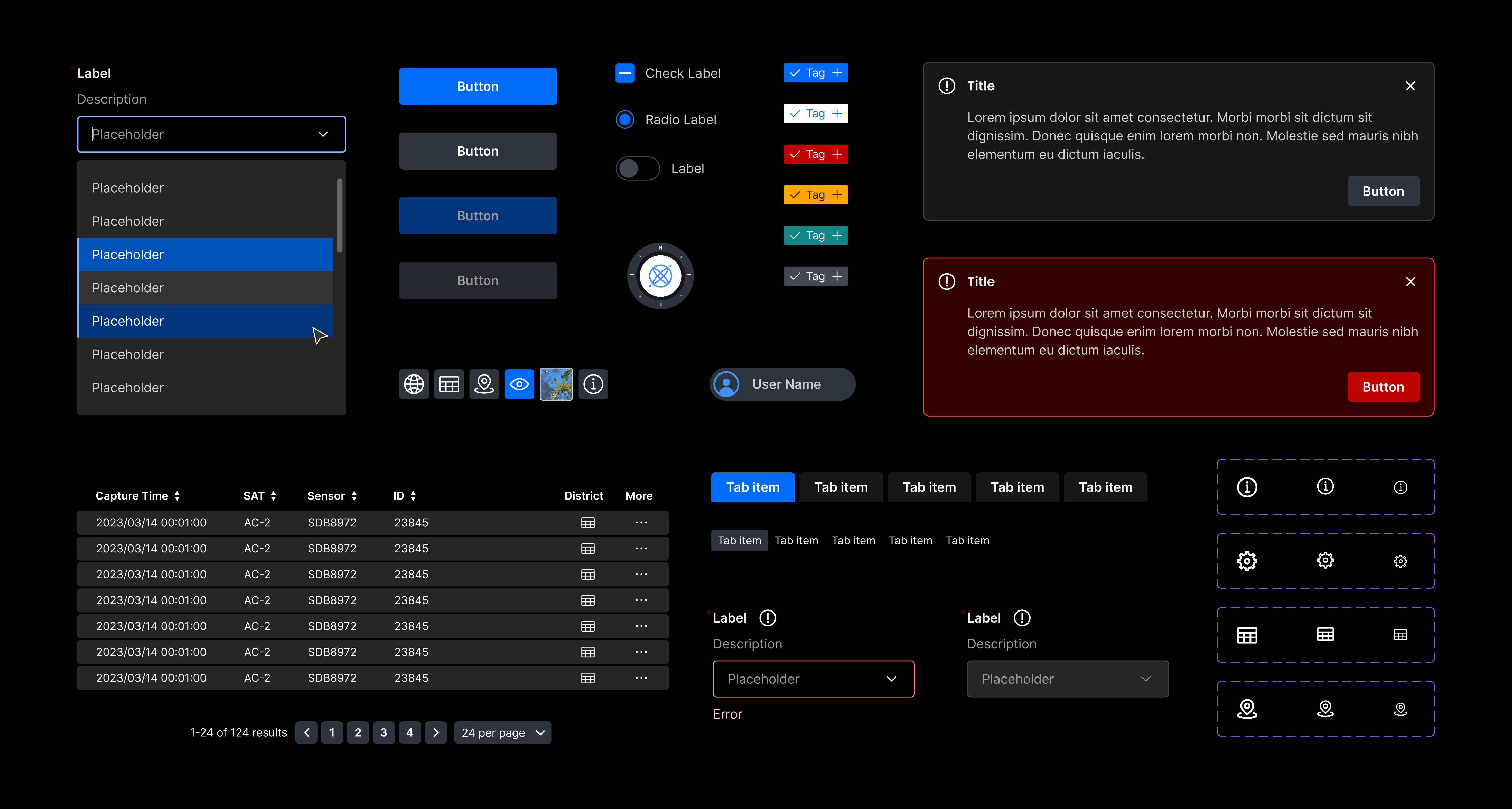
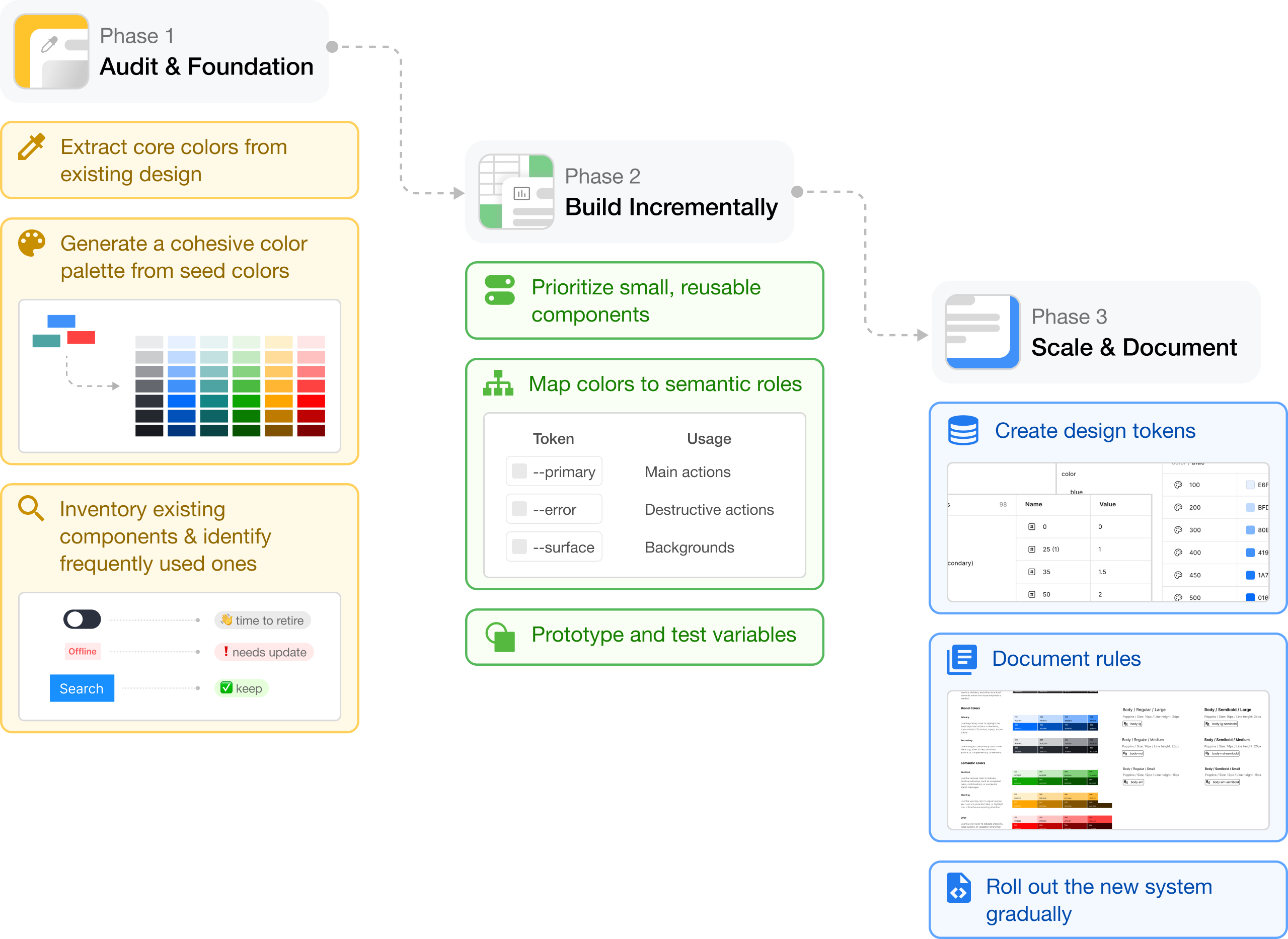
Starting with limited initial assets (e.g., only a few theme colors) is a strategic opportunity to build systematically. First, I extracted core colors and expanded them into a full palette. After auditing existing components, I incrementally rebuilt atomic elements, mapped tokens, and tested prototypes. Once validated, I finalized design tokens & documentation, and the team rolled out the system gradually across products.
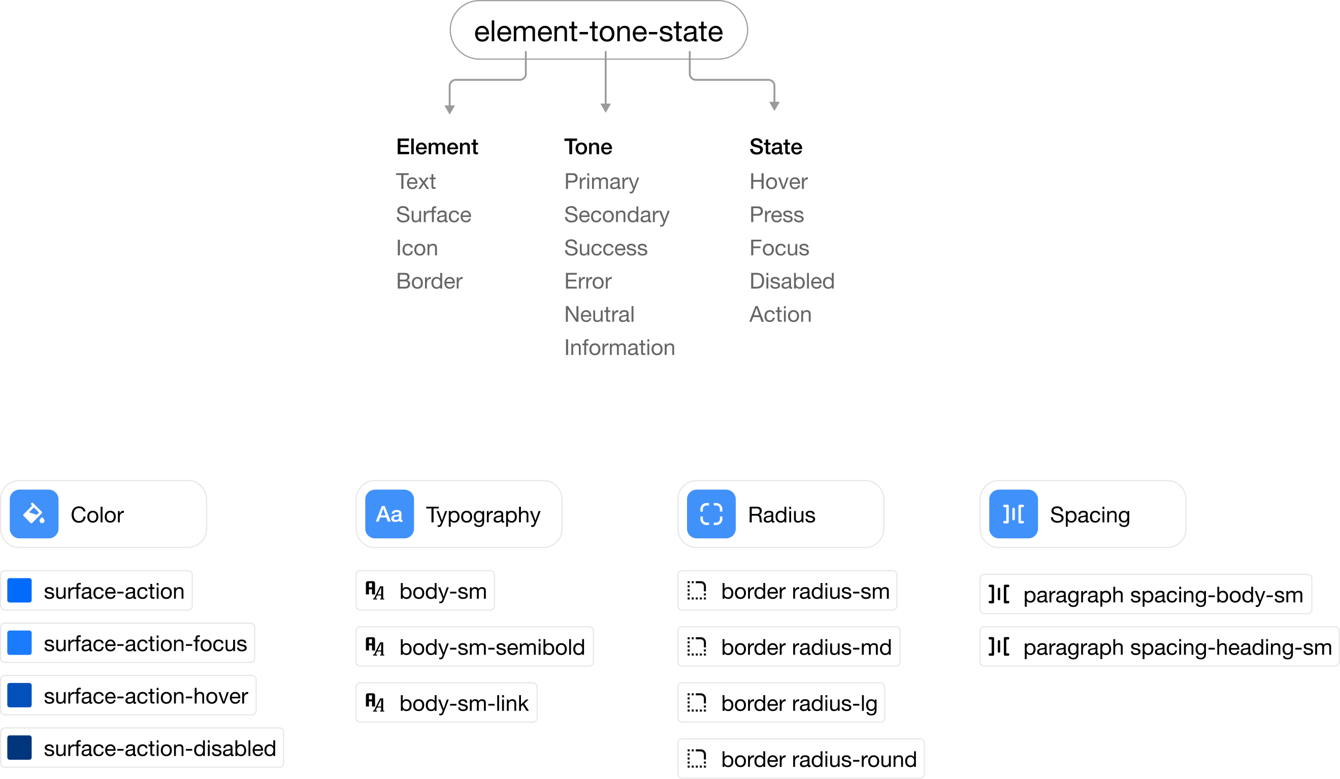
Given the scope of our complete UI overhaul, I implemented a layered design token architecture to ensure consistency and efficiency across design and development workflows. I established a four-tier system: raw values→base tokens→alias tokens→semantic tokens. Each semantic token includes a descriptive usage guideline.
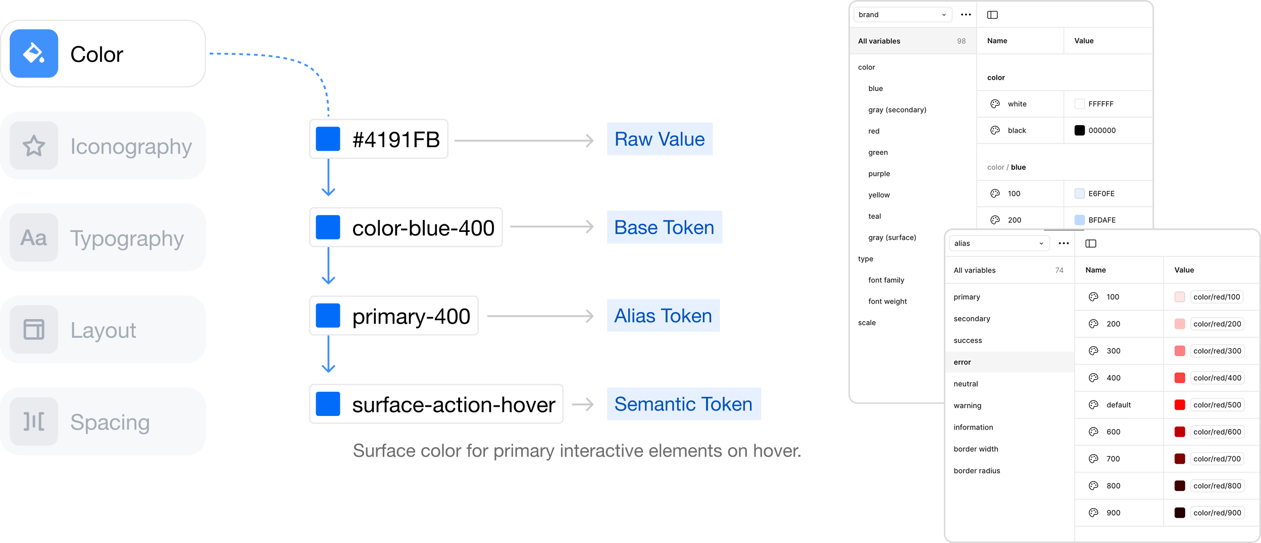
Each semantic token follows a clear naming convention that communicates usage context and purpose to team members.
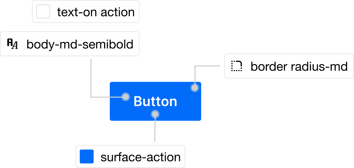
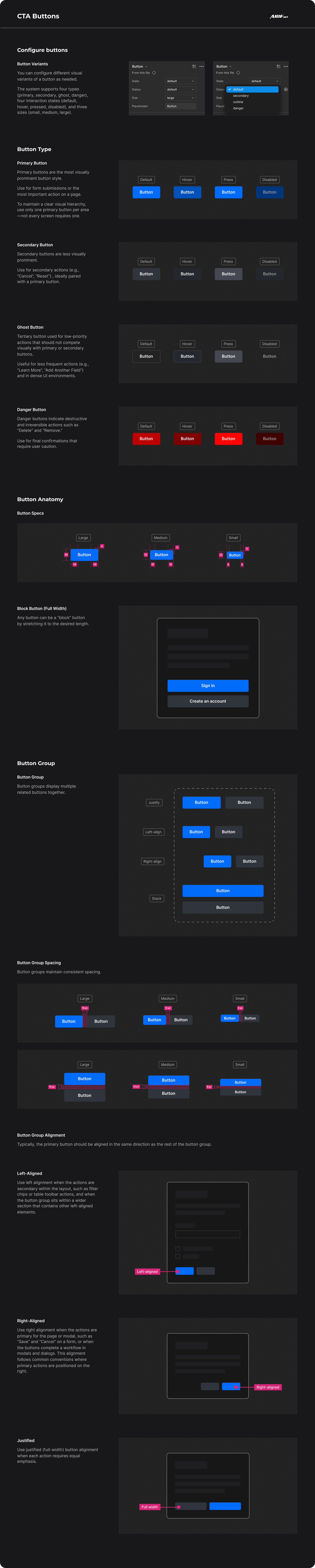
Here’s an example of a button component built using design system tokens.
Each visual property references semantic tokens.
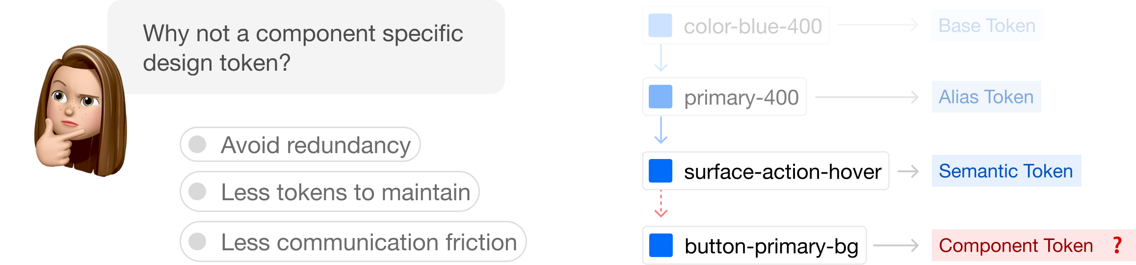
I deliberately avoided adding a component layer to reduce complexity—semantic tokens already align with usage contexts, additional abstraction layers would create communication friction between designers and developers and make token inheritance harder to track and maintain.
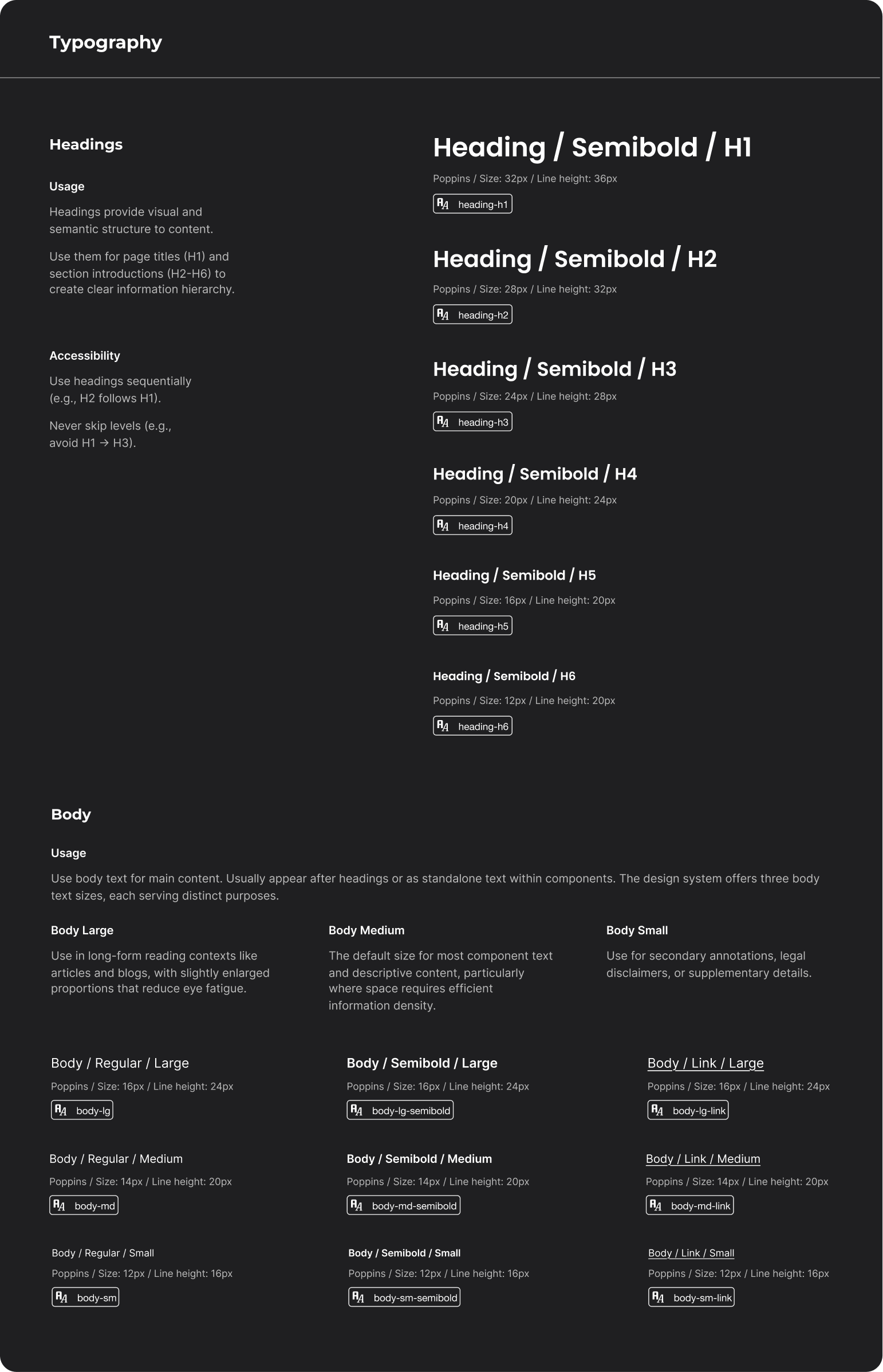
The typography system is organized into two primary categories - headings (H1-H6) for information hierarchy and body text variants for different reading contexts.
Each style includes specific usage guidelines and accessibility best practices.
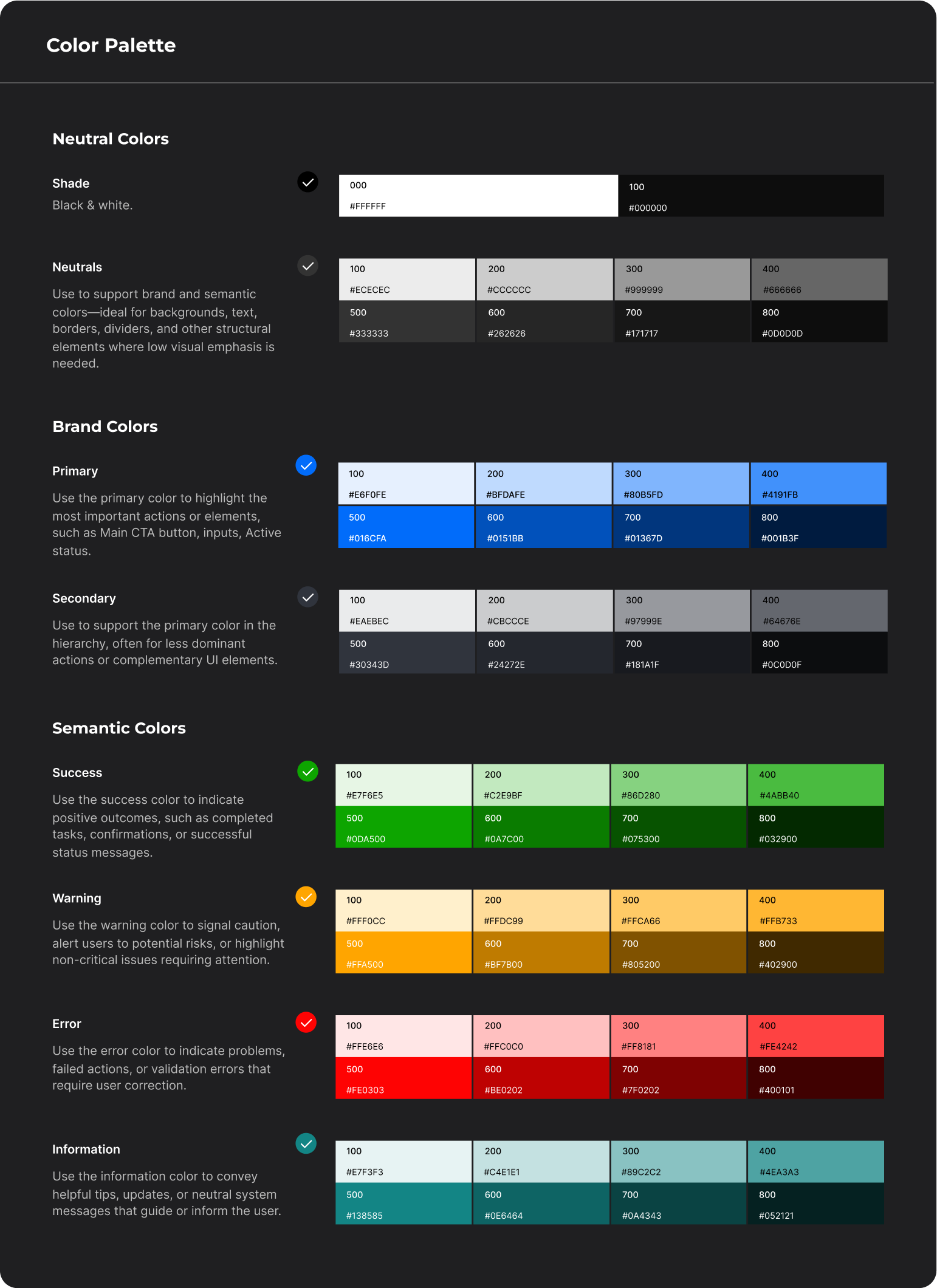
The color system is organized into three strategic groups - neutral colors, brand colors, and semantic colors on a 100-800 scale.
In the documentation, each color includes implementation guidance - when to use it, which colors provide sufficient contrast, and how to use them across different states (hover, active, disabled, etc.).
Each component has a dedicated documentation page that includes:
- Clear explanation of what the component is, its purpose, and how it should be used
- Suggested best practices for implementation along with specific don'ts and common mistakes to avoid
- Examples showing how components work together, such as how input fields combine with buttons to create forms, or how cards group with navigation elementsAll component variants
While the process appears methodical—the true challenge lies in the granular details: pixel-perfect token alignment, edge-case component states, and obsessive documentation. Every decision cascades; a single color variable or spacing token, if misplaced, can ripple through the entire system.
This project taught me the difference between organizing documentation for myself versus for my actual users. While I naturally organize information in ways that make sense to me, creating effective design system documentation meant stepping outside my personal preferences to understand how designers and engineers actually work and access information. The challenge wasn't just what to document, but structuring it in a way that serves their workflows rather than my own.
